





Warm White vs Cool White Christmas Lights for Commercial Displays
Neither warm white nor cool white is the universal choice for a commercial Christmas display. Warm white may support a softer, more traditional or intimate visual direction; cool white may support a crisper, more wintry or contemporary direction. The right answer depends on the property’s approved concept, surrounding finishes, existing ambient light and the appearance of the exact product sample.
For a shopping center, hotel or commercial street, the safest buying decision is not to select from a color name alone. Define the intended impression, compare the candidate under relevant site conditions and keep a record of the sample or product version that was approved. This turns a subjective preference into a usable supplier brief without pretending that one shade works for every venue.

What Warm White and Cool White Actually Describe
Warm white and cool white describe the visible color appearance of nominally white light. Correlated color temperature, usually shown as CCT in Kelvin, is commonly used to communicate that appearance. Lower values generally look more yellow or warm; higher values generally look whiter or more blue.
CCT is useful, but it is not a complete description of what guests will see. Two products carrying a similar color label—or even the same nominal CCT—can still look different because color appearance involves more than one number. Camera settings, surrounding light, colored surfaces and the construction of the finished decoration can also change how the result appears in a photograph or at the venue.
Do not confuse color temperature with brightness, color fidelity or light-source technology. “Warm white” does not state how bright a product is, how accurately nearby decorations will appear or whether the source is LED or incandescent. If the project has not yet settled the underlying technology route, review LED versus incandescent commercial Christmas lights as a separate decision.
Compare the Two Directions Against the Same Visual Task
Start with one defined display position or product family. Use the same viewing context, operating period and surrounding environment when comparing both directions.
| Buyer question | Warm-white direction | Cool-white direction | Evidence that should decide |
|---|---|---|---|
| What impression is approved? | May support a softer, traditional or intimate impression | May support a crisp, icy or contemporary impression | Approved mood board, brand reference and decision owner |
| What colors and finishes surround the display? | Test against warm metals, timber tones, fabrics and existing warm light where relevant | Test against silver, white, blue, glass or cooler ambient light where relevant | Current site photos, finish references and an exact candidate sample |
| Must it match an existing display? | Do not assume every “warm white” product matches | Do not assume every “cool white” product matches | Side-by-side comparison with the retained source or approved reference |
| How will it look at the real viewing time? | Check whether the tone remains distinct within existing ambient light | Check whether the tone becomes too stark or blends with surrounding cool light | On-site or representative review at the intended operating time |
| How will products look together? | Confirm consistency across strings, motifs and supporting elements | Confirm consistency across strings, motifs and supporting elements | Samples from the exact candidates and a documented acceptance reference |
| Is a mixed palette intentional? | Assign a defined role rather than mixing similar warm shades by accident | Assign a defined role rather than mixing similar cool and neutral shades by accident | A simple color-direction brief showing where each tone is intended |
The descriptions in the middle columns are design possibilities, not venue rules. A luxury hotel is not automatically a warm-white project, and a modern mall is not automatically a cool-white project. The evidence column should carry more weight than a generic style label.

Let the Existing Environment Influence the Decision
The same decoration can read differently in two properties. Before approving a shade, document the light and surfaces already present around the proposed position.
Look at facade lighting, lobby fixtures, shopfronts, signage, reflective glazing, metal finishes, stone, timber, greenery and colored ornaments that will remain visible. Record whether the Christmas display must blend with them, create deliberate contrast or remain visually separate. “Match the building” is too vague for a supplier; identify the reference that is meant to match.
Ambient light also changes throughout the day. A sample reviewed in a dark room may not represent a bright atrium, illuminated hotel entrance or street with strong shopfront lighting. Where practical, review the candidate at the intended operating time or in a controlled setup that reproduces the relevant background. If that is not possible, state the limitation instead of treating the sample as conclusive.
Use Venue Type as Context, Not as a Shortcut
Shopping centers
A shopping center may need one white-light direction to remain coherent across a large focal element, storefront surroundings and smaller supporting decorations. The key question is whether the exact candidates appear consistent within the mall’s existing ambient light and approved seasonal palette. This article does not assign colors by zone or recommend a product layout.
If the color decision is part of a larger family-selection task, keep the parent حلول تجارية لزينة عيد الميلاد separate. Decide the display roles there; compare warm and cool white only for the candidates that need a white-light direction.
الفنادق والمنتجعات
A hotel may judge the color direction against arrival lighting, lobby finishes, restaurant entrances, brand standards and the close-view experience of guests. Warm white can be tested when the brief calls for a softer or traditional impression; cool white can be tested when a cleaner or wintry contrast is intended. Neither description proves that the candidate will harmonize with the property.
Ask the decision owner to approve the exact visual reference. A verbal request for “luxury warm white” or “clean cool white” is not precise enough when purchasing multiple items or ordering replacements later.
Commercial streets and mixed-property settings
A commercial street may contain different storefront lighting, facade colors and public lighting along one route. The goal is not necessarily to make every source identical. It is to prevent accidental inconsistency and to document where contrast is intentional. Keep public-lighting requirements and local approvals with their responsible parties; this page makes no technical or regulatory recommendation.
Approve the Sample, Not Just the Color Name
The strongest color decision links an exact candidate to an approved reference. Ask the supplier to identify the product or sample version, the stated color description and any available product-specific color information. If several product families must appear together, request representative samples for each family rather than assuming one sample controls them all.
Review samples side by side under the same conditions. Include the existing light or reference item when matching is important. Observe the result from the intended viewing distance as well as close up, because small differences may become more or less noticeable when an entire illuminated form is seen.
Record the date, sample identity, viewing condition, comparison reference and decision owner. Photographs can support that record, but they should not replace visual review: exposure, white balance and screens can alter the apparent shade.
An approved sample is still a reference, not proof that every future unit or replacement will look identical. Before order confirmation, ask how the exact supplier controls color consistency, what variation basis applies to the candidate and whether the approved sample is tied to the intended production. Do not invent a tolerance when no current document exists.
Decide Whether One White or a Deliberate Mix Is Needed
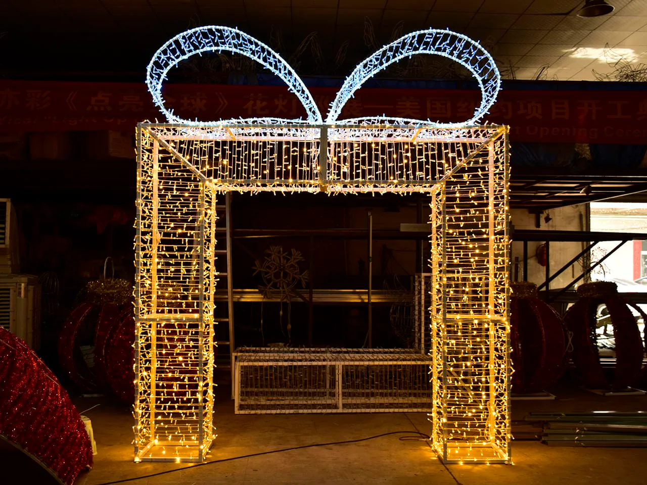
Warm and cool white can coexist when the contrast has a clear purpose. For example, a buyer might test one tone for the main decorative form and another for a defined accent. That is an illustrative design direction, not a recommendation for a particular venue.
Problems arise when similar but visibly different whites are combined unintentionally. A warm-white string from one source may not match another supplier’s warm-white motif. A nominally cool-white product may sit beside neutral-looking architectural light and lose the intended contrast. The solution is not to create a complex color plan; it is to identify the role of each white tone and compare the exact items together.
Use one short instruction: single white direction, deliberate warm/cool contrast, أو hold pending sample comparison. If a mixed direction is approved, mark which product family carries each tone and keep the reference images or samples with the purchasing record.
Create a Concise Color-Direction Brief
The buyer’s brief can fit on one page. Include:
- venue type and exact display position or product family;
- approved visual impression in plain language;
- current site photographs taken under relevant ambient-light conditions;
- surrounding finishes, colors and existing lights that must match or contrast;
- brand, mood-board or retained-display reference;
- warm-white, cool-white or mixed direction under consideration;
- exact candidate/sample identity and version;
- viewing condition and date used for comparison;
- consistency questions across product families, quantities or later replacements;
- named decision owner and any unresolved mismatch.
This is a color-selection record, not a full procurement specification. Product suitability, dimensions, electrical details, environmental exposure, installation, safety, compliance, price, quantity and timing require their own current evidence and responsible review.
Know When to Hold the Decision
Do not approve the color direction when the decision rests only on an edited image, an unlabeled sample or a generic “warm/cool” sales term. Hold when the candidate identity is unclear, two products have not been viewed together, the site lighting is materially different from the review condition, or the supplier cannot explain how the approved reference relates to the intended production.
A hold does not mean the color is wrong. It means the evidence is not yet strong enough to make a repeatable purchase decision. Name the missing item—such as current site photographs, an exact sample, a comparison with an existing decoration or a consistency statement—and assign a decision owner.
الأسئلة الشائعة
Is warm white always better for hotels?
No. Warm white may support a softer or more traditional concept, but the correct direction depends on the hotel’s finishes, ambient light, brand reference and exact candidate sample. Review the actual product in a representative condition before approving it.
Is cool white brighter than warm white?
The label alone does not establish brightness. Warm and cool describe color appearance, while brightness requires separate product information and a comparable viewing task. Do not use a cooler appearance as proof that one candidate produces more light.
Can the same nominal CCT still look different?
Yes. CCT is a useful but simplified description of white-light appearance. Other color characteristics, the finished product, surrounding light and viewing conditions can affect perception. Compare exact candidates together when consistency matters.
Should all decorations in one project use the same white?
Not necessarily. One consistent white can simplify visual coordination, while a deliberate warm/cool contrast may support an approved concept. What matters is that the difference is intentional, documented and checked with the actual candidate samples.
What should a buyer send before asking about color options?
Send current site photos, surrounding-light and finish references, the approved visual direction, relevant product or sample identities, and any item that must match. State whether the decision is warm white, cool white, a deliberate mix or still pending comparison.
Move from Preference to a Verifiable Product Discussion
Warm white and cool white are useful starting labels, but the purchase decision belongs to the exact display, site and sample. First agree on the visual impression. Then compare the candidate under relevant ambient light, record the approved reference and ask how that reference relates to the intended production.
After the color direction is clear, buyers can review relevant منحوتات أضواء عيد الميلاد التجارية without treating category images as color proof. Prepare the concise brief above and share the color-direction brief with HYCLight for a product-specific discussion. This does not promise a particular color option, sample match, design, quotation, response time or project result.